The Psychology of Colours in Web Design
The Psychology of Colour in Web Design
Colours may affect our feelings and decisions. You may develop websites that satisfy your design objectives and provide a great user experience by understanding how colors function.
For instance, a yoga studio would use blue to evoke a sense of peace or safety, while a bank might use red to evoke reliability and trust. The success of your website depends on how you use color in ways that are consistent with the personality of your business.
Table of Contents
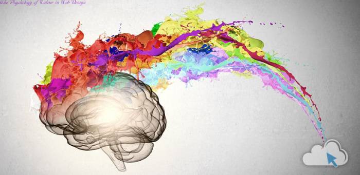
Colors that Catch the Eye
It shouldn’t be a surprise to designers or managers of digital marketing that color is crucial to site design. After all, the color of a website may increase conversions, spur consumer action, and catch users’ eyes. Additionally, it might foster a perception of your company that affects your reputation over time.
According to a study, colors may influence a person’s trustworthiness, brand loyalty, and opinion of a firm within the first 90 seconds. Knowing this, it’s crucial to take into account each color’s psychological connotations while designing a website.
For instance, when appropriately employed, orange has a propensity to elicit emotions of enthusiasm, inventiveness, and vitality. However, going overboard might make a website appear disjointed and disorderly.
Trust-Inspiring Colours
Your website’s color scheme ought to reflect the feelings you hope to convey. Red, for instance, is fervent and captivating. A call to action button or a hero picture might leverage it to draw in potential customers.
By using the appropriate colors, you may increase user trust and encourage them to buy from you or subscribe to your email list. In fact, color has the power to sway 85% of consumer purchasing choices.
Despite the belief that pink is a girl’s color and blue is a boy’s color, men and women really react to some colors differently. For instance, according to Kissmetrics, women find orange, brown, and grey to be the least attractive colors, whereas they like blue, purple, and green. Because of this, it’s critical to comprehend the makeup of your target market and pick colors that appeal to them. This will guarantee that the broadest potential audience will find your website appealing.
Energy-Transmitting Colours
It’s no secret that customers’ reactions to various colors may vary. For this reason, while building a new website or updating an existing one, many designers use color psychology. It’s a potent method for influencing website visitors’ behavior and encouraging conversions.
Red and orange, for instance, evoke sentiments of urgency and enthusiasm. On the other side, green induces a sense of rest. Both of these may be utilized to persuade website visitors to respond to a CTA.
But take caution not to exert too much pressure. Your audience will find the improper colors offensive and might not be responsive to your marketing efforts if you employ them. A/B testing is crucial for all design evaluations for this reason. Your conversions may increase significantly with a bit of adjustment, such as turning a green CTA button into a yellow one. According to a case study by Moz, a slight adjustment in color had a significant impact on their website’s conversion rates.
Message Colours for Safety
A website needs to be more than just attractive. It must keep consumers’ interest while subtly leading them through a conversion funnel. Additionally, it must arouse particular feelings and convey the proper perception of your business.
Your colors must be able to convey a clear message in order to do this. This is why it’s crucial to comprehend color psychology while designing websites.
For instance, red may be good at drawing attention, but it also symbolizes danger, aggressiveness, battle, and fire. This can give visitors the wrong impression and cause them to leave your website.
Yellow, on the other hand, is upbeat and vivacious and is a good choice for expressing enthusiasm, excitement, energy, and fun. Such websites as Whataburger, Orange Soda, and Story Cubes frequently employ color to advertise a fun or exciting experience. To get the most remarkable effects, match it with white or various hues of grey.
Also read:- The Beginning of a New Era in Online Gaming